
CBD Packaging USA: 7 Design Tips for Better Branding
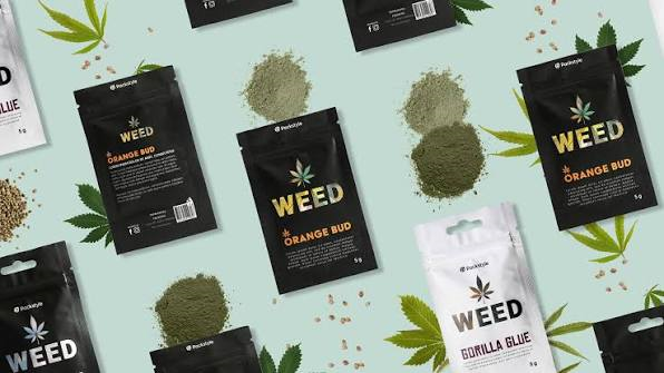
Selling CBD in the United States means designing packaging around a moving target. Rules differ by state, enforcement differs by state, and what's required on a label in one place isn't always required or even allowed in another. That's a harder starting point than most product categories deal with. A brand that gets the design right anyway tends to stand out for a simple reason: most competitors are still figuring out the basics.
1. Build Around State-by-State Compliance, Not a Single Template
There's no one national standard covering every CBD labeling requirement, which means a box designed for one state can run into trouble in another. Milligram disclosures, sourcing statements, sometimes QR codes linking to lab results the exact mix shifts depending on where a product actually ships. Brands selling across multiple states need packaging built with that variation in mind from the start, not a single template stretched to cover every market and hoping nothing gets flagged.
Working with a packaging partner that already tracks these differences saves a lot of guesswork. One Custom Boxes handles this kind of multi-state compliance regularly, building CBD packaging that adjusts to what each market actually requires instead of defaulting to a one-size-fits-all layout.
2. Put Lab Results Where Buyers Can Actually Find Them
CBD still has a trust problem in parts of the market too many products over the years didn't match what the label claimed, and buyers remember that. A visible batch number or a QR code linking straight to a certificate of analysis solves this better than any amount of marketing copy could. It's not a big design lift. It's just making sure that information isn't buried somewhere nobody looks.
3. Stop Defaulting to Kraft Board Automatically
Kraft has become the go-to look for "natural" CBD packaging, and there's a reason it's affordable, it prints well, and it signals something buyers associate with clean sourcing. But it's also become the default for nearly every brand in the category, which means it's stopped standing out. A clean white box with sharp typography, or even a darker, more clinical palette, can separate a brand from a shelf full of near-identical kraft boxes doing the exact same visual thing.
4. Design the Compliance Text In, Not Around It
Every CBD box in the U.S. carries some version of mandatory disclosures dosage, warnings, sourcing claims and cramming that in after the branding is finished almost always looks bad. The better approach treats the required text as part of the layout from day one. Give it a defined space early, and the rest of the design ends up cleaner because nothing's fighting for room at the last minute.
5. Get the Dosage Information Impossible to Miss
CBD packaging is doing more than looking good it's telling someone how much of something they're about to take. That information needs to be the first thing a customer sees, not something they have to hunt for on a side panel. Product name and strength up top, everything else secondary. This isn't really a branding decision so much as a basic usability one, but it affects branding anyway, since packaging that's confusing to use reflects poorly on the company behind it regardless of how nice it looks.
6. Match the Finish to Who's Actually Buying
CBD packaging USA brands sell to varies a lot wellness-focused buyers looking for something clinical and trustworthy, and a younger, more design-conscious crowd that wants something that looks intentional rather than medicinal. Matte finishes read as considered. Glossy coatings can feel dated or overly clinical depending on the audience. There's no universal right answer here, but there is a wrong one: picking a finish that doesn't match the actual customer base a brand is selling to.
7. Use Color Coding for Multiple Potencies
Brands selling more than one strength of the same product run into a real risk if packaging doesn't differentiate clearly a customer grabbing the wrong potency isn't just a bad experience, it's a genuine safety issue with a product like this. A consistent color system tied to each strength fixes that with almost no added cost. It's a small design choice that does real functional work, not just a branding flourish.
Getting the Basics Right
None of these seven tips require an expensive packaging overhaul. Most of them come down to treating compliance as part of the design instead of an obstacle to design around, and paying attention to what CBD buyers actually need to see fast dosage, sourcing, proof the product is what it claims to be. Brands that handle this well end up with packaging that holds up under regulatory scrutiny and still looks like something worth trusting on a shelf, which in this category is most of the battle.

 English
 Arabic
 French
 Spanish
 Portuguese
 Deutsch
 Turkish
 Dutch
Dutch
 Italiano
 Russian
 Romaian
 Greek
Greek
