
The Art of Visual Cooling: Styling Your Home with Lightweight Block-Print Textiles
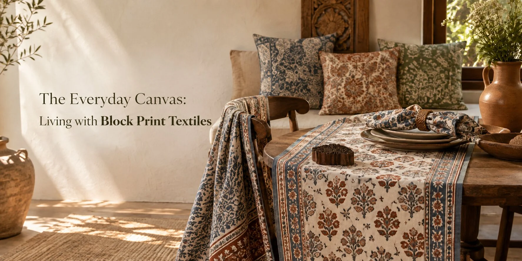
A room can feel heavy before the temperature rises. Dense curtains, thick upholstery, and layered fabrics absorb light, crowd surfaces, and make even a balanced interior appear warmer. Lightweight block-print textiles offer a more effective seasonal shift.
Cotton runners, cushion covers, napkins, and small surface mats add pattern without covering every visible area. Their softer drape also reduces the visual bulk around furniture and dining spaces. The strongest summer interiors are not stripped bare. They feel considered, with lighter fabrics doing most of the work and richer embroidery reserved for a few focused details.
Principle 1: Start with the Fabric
Seasonal clothing offers a quick way to judge fabric weight. Printed lawn shirts cut from unstitched lawn replace heavier layers because the cotton feels lighter against the body. Ready-to-wear pieces made from Pakistani block-print fabric follow a similar preference for cotton, movement, and surface pattern.
Inside the home, the effect is mostly visual. A narrow cotton runner leaves more of a wooden table in view than a full cloth. At the window, a lighter panel keeps the opening connected to the room instead of turning it into a dark, fabric-covered wall.
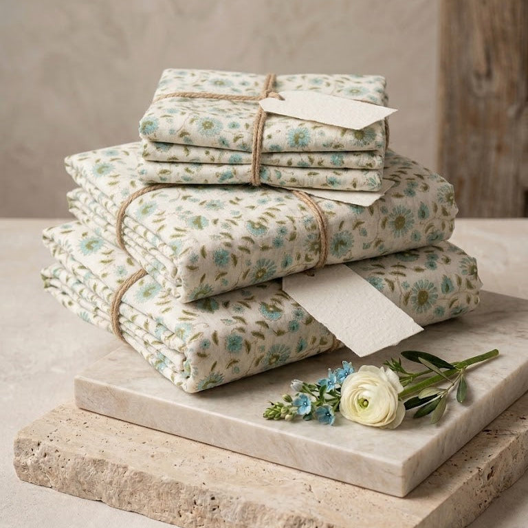
Cotton deserves the larger roles in a warm-weather interior. Use it across curtains, cushions, napkins, and everyday table textiles. Save dense embroidery or padded material for smaller areas where texture has a clear purpose.
Four Checks Before Choosing a Textile
- Hold the cloth against a window. Light passing through the weave gives a better sense of how it will sit in a bright room.
- Scrunch a corner in one hand, then release it. A soft fall usually works better over a chair or table than a fabric that stays stiff.
- Check the reverse side for thick backing or lining. These finishes add body and may suit privacy-focused rooms more than open living areas.
- Place the textile on the intended surface before deciding. A print that looks balanced when folded may dominate once spread across a full table.
The last check matters most. Fabric should be judged at the scale in which it will be used, especially when the print has large motifs or strong colour contrast.
Principle 2: Let the Fabric Move
Straight-backed chairs, boxy sofas, and rectangular tables create a room full of firm edges. Soft cotton breaks up those lines through folds and irregular placement. Block print home décor works especially well here because the pattern carries character without needing several extra layers.
A throw folded into a perfect square often looks like display styling. Place it slightly off-centre instead, with one end falling over the arm of the chair. The furniture remains visible, while the loose edge makes the corner feel easier and less formal.
The same approach applies to cushions. Covers do not need sharp, pressed corners to look finished. A cotton cushion with a natural crease can sit comfortably beside plain upholstery and still feel intentional.
Movement Without Clutter
At the window, use lighter panels where privacy and direct sunlight allow. They can soften glare while keeping the room connected to daylight.
On a sofa, one printed cushion often carries more presence than four competing patterns. Pair it with plain cotton covers drawn from one of the print’s quieter colours.
A reading chair needs only one textile accent. A loose throw over the arm adds softness, while a second blanket folded across the back can make the chair look prepared for winter.
Avoid starch on summer cotton. The crisp finish removes the relaxed drape that makes the material useful in the first place.
Print placement also changes the mood. A block-print cushion placed slightly away from the centre of a sofa feels casual. A perfectly symmetrical row creates a more formal result, even when the fabrics themselves are light.
Principle 3: Build the Table Around One Anchor
A dining table needs a centre, especially when most of its surface is left uncovered. Without a focal point, napkins, plates, glasses, and serving pieces can look like separate decisions. One textured element is enough to organise them.
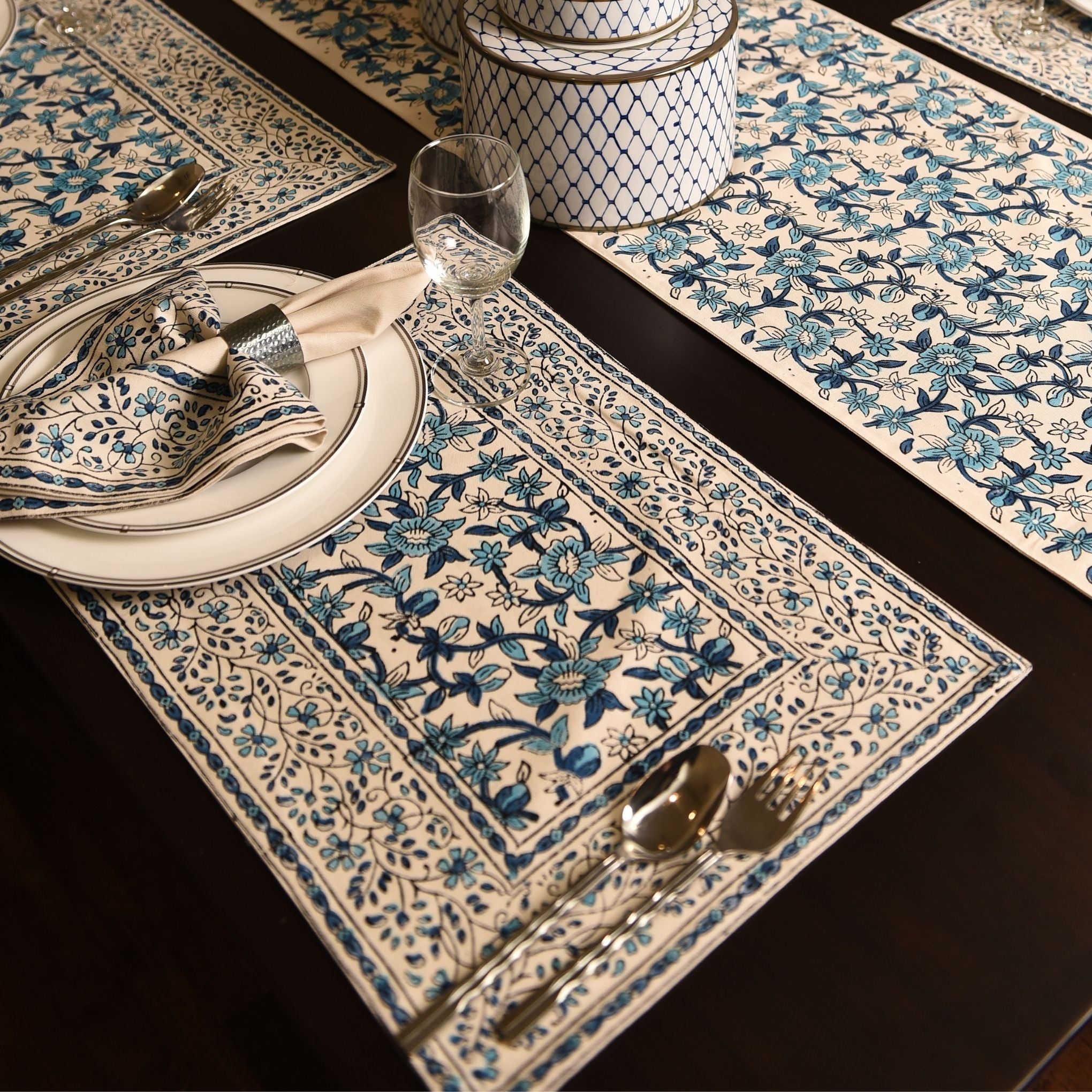
For handmade dining table decor, an embroidered table runner is a practical anchor. Place it along the centre and allow the tabletop to remain visible on both sides. Cotton dining table napkins can pick up one colour from the embroidery without copying the full pattern.
Matching every item is rarely the best choice. A runner with detailed threadwork looks stronger beside simpler napkins than beside placemats carrying the same level of decoration. The contrast lets each piece keep its role.
A Flexible 80/20 Approach
The 80/20 idea is a styling guide, not a measurement exercise. It helps prevent embroidery and layered decoration from taking over the table.
- Let simple cotton pieces make up most of the setting. Napkins, slim placemats, and plain seat cushions can form the quieter base.
- Choose one area for concentrated detail. The runner, a bread basket lining, or a single centrepiece cloth can carry the richer work.
- Leave gaps between textile elements. Visible wood, glass, marble, or stone keeps each printed piece distinct.
- Repeat one shade across the setting. A blue line in the runner might return in the napkins or serving bowl.
- Remove a layer when plates and serving dishes begin to feel crowded.
A full tablecloth is a poor choice when the table itself has a finish worth showing. On polished wood, for example, a runner and six folded napkins create enough pattern for a dinner setting. Adding placemats, chargers, and another cloth underneath leaves little room for the material of the table to contribute.
Serving space is another reason to edit. Bowls, water jugs, and shared dishes need clear positions. Decorative textiles should support the meal instead of turning every available area into display space.
Principle 4: Use Small Textiles Where Daily Routines Happen
Tea trolleys, bedside tables, consoles, and coffee corners are working areas. They collect glasses, cups, trays, lamps, keys, and small personal objects. Covering the full surface can make these already compact zones look busier.
Handmade trolley mats offer a more controlled way to add pattern. One mat beneath a teapot creates a clear serving area while the trolley shelf remains visible. On a glass surface, cotton also softens the meeting point between the tray, cups, and tabletop.
The placement should follow the object. A mat under a bedside lamp needs enough room for the lamp base and perhaps a water glass. It does not need to stretch beneath every item on the table.
Where Small Textiles Earn Their Place
- Tea trolley: Set one mat under the teapot or main serving tray. Keep the lower shelf open unless it carries another defined group of items.
- Bedside table: Place a compact textile beneath a lamp, jewellery dish, or water glass. Leave room for a book or phone.
- Entryway console: Use a mat to hold a bowl or vase in place visually. Keys and everyday items can sit beside it in place visually.
- Serving tray: Line the tray with cotton when the surface looks too hard or reflective. Choose a print that remains visible around the base of the cups.
- Coffee station: Mark the cup area with one washable mat. Covering the whole counter usually makes spills and crumbs less noticeable until cleaning time.
The scale of the textile matters more than the amount of decoration on it. A small mat with a clear border of wood or glass around it looks deliberate. When the cloth reaches every edge, it begins to resemble a cover.
Let One Block Print Lead the Room
Pattern becomes tiring when every textile asks for attention. Curtains, cushions, runners, and mats should not all compete at the same volume. Choose one print to lead each area, then let the other pieces support it.
Large or closely spaced motifs work best on one controlled item. A bold floral runner, for example, can sit at the centre of a plain table with solid napkins. Repeating the same scale across curtains and cushions would make the room feel much denser.
Smaller motifs suit pieces that appear several times, such as dining napkins or a pair of cushion covers. The repeated pattern remains readable without forming one large block of colour.
Work with the Room’s Existing Colours
Soft blues, muted reds, earthy greens, and warm neutrals often sit comfortably beside wood, cane, stone, and off-white walls. Their success comes from how they relate to the room, not from the colours alone.
A strong print can still belong in a summer interior. Give it clear space. A deep indigo cushion looks sharper on a plain sofa than in a group of several equally dark patterns.
Start with the largest permanent features in the room. Flooring, wall colour, upholstery, and furniture finish should guide the textile palette. Buying a print first and trying to force it into the space later often leads to unnecessary matching.
Conclusion
Visual cooling begins with editing the amount, weight, and placement of fabric in a room. Cotton curtains, relaxed cushions, narrow runners, and compact mats can introduce craft without hiding the furniture beneath them.
Keep the broad areas quiet. Let one embroidered or strongly patterned piece provide focus, then leave enough open surface for the room to breathe visually.

 English
 Arabic
 French
 Spanish
 Portuguese
 Deutsch
 Turkish
 Dutch
Dutch
 Italiano
 Russian
 Romaian
 Greek
Greek
